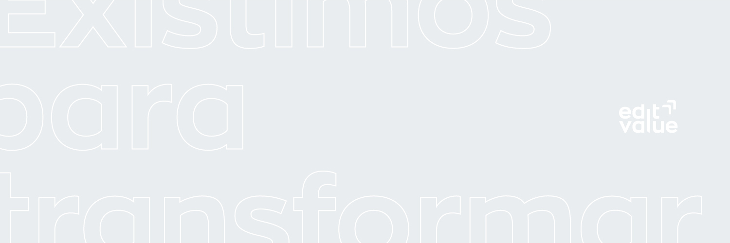
Edit Value
DISCIPLINE
Brand Identity
Web Design
YEAR
2019
TEAM
Netgócio
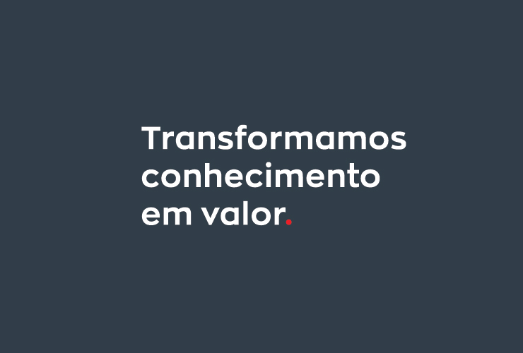
The Edit Value Group is a reference in the provision of management services. Based on the slogan “Transformámos conhecimento em valor” (We transform knowledge into value) they foster the development and productivity of their customers, boosting them in areas like Finance, Strategy and Human Resources.
With an identity dated from 2008, Edit Value requested a renewal of its image in order to propel them towards their next objective, the expansion of their offices and team to other cities.
In this project I was responsible for the entire rebrand, which included the development of a new website.
SOLUTION
The new identity had to convey confidence and professionalism, something for which the company was already recognized for but was not reflected in its identity. Custom typography and a robust color palette were essential to give a new life to the brand.


The previous identity (left) and the adaptation to the new concept (right)
Concept
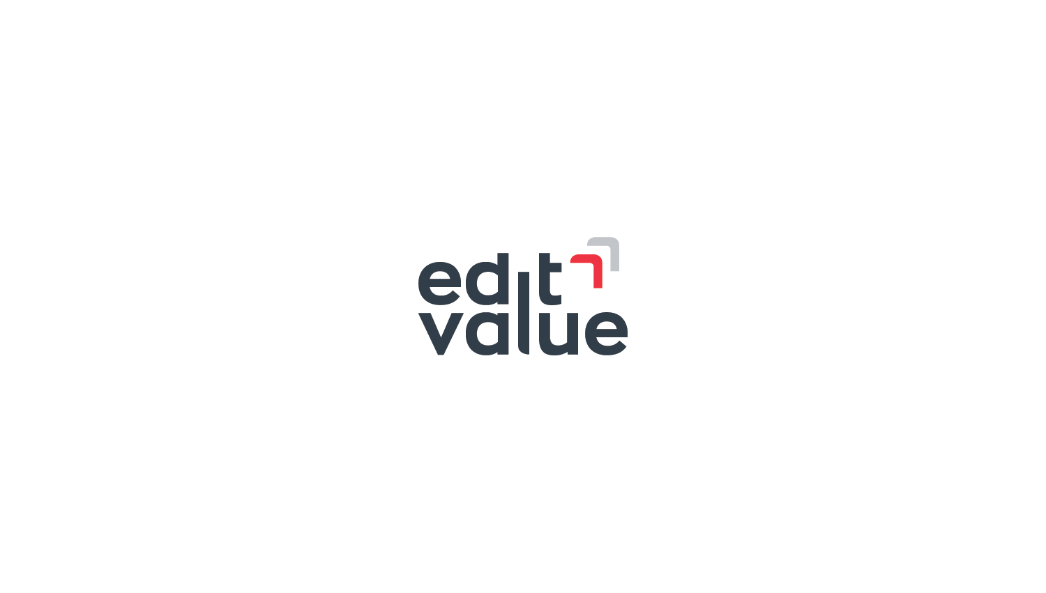
Edit Value's original symbol started from the overlapping of 2 squares, representing the 2 services that the company provided: advanced and complete solution. (old logo)
When restructuring in 2019 (which led to the development of this project), Edit Value reinvented itself in terms of communication and services provided. (now 3 instead of 2)
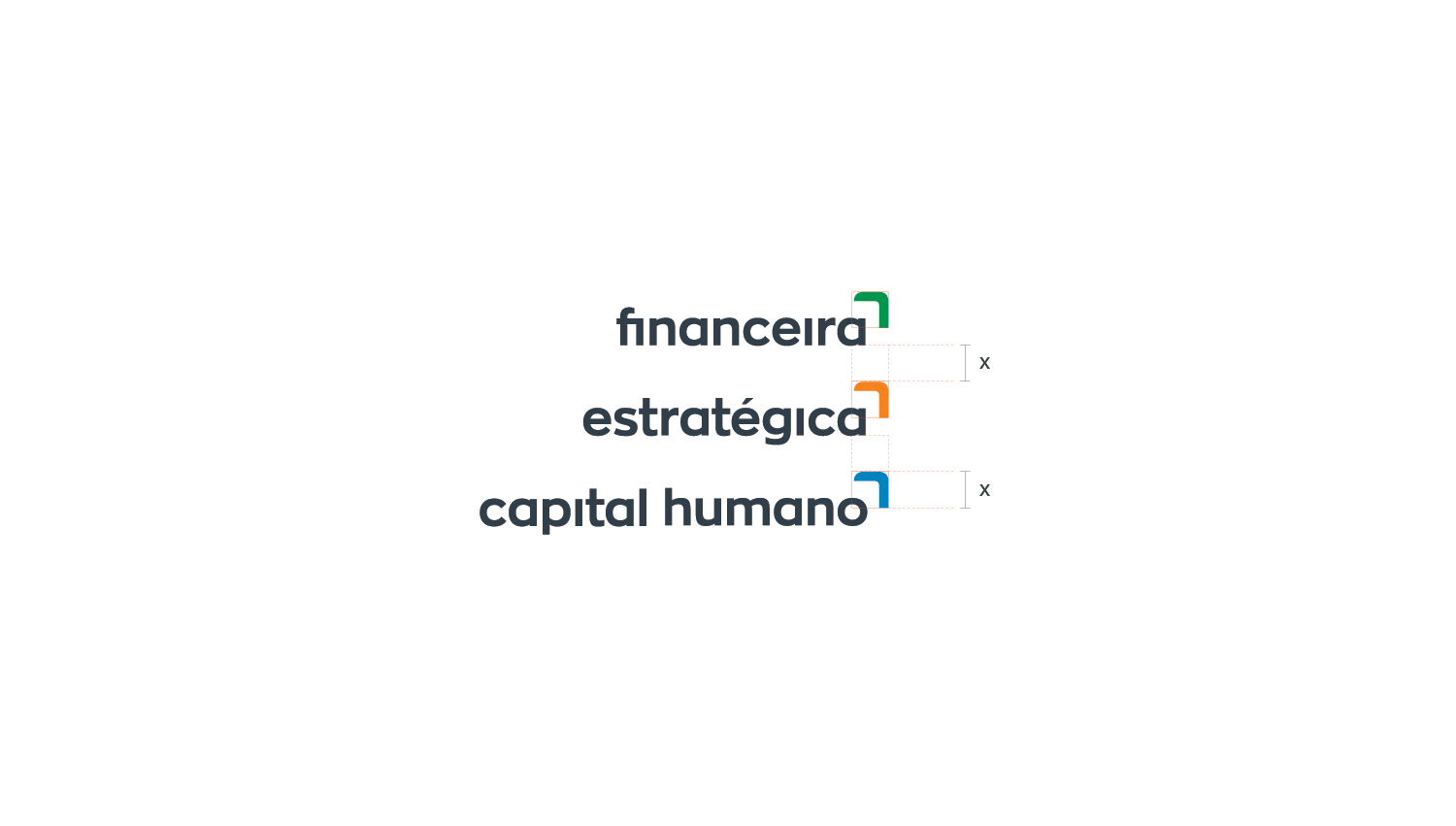
The new identity is inspired by the previous one, starting from the same base of overlapping forms. However, it assumes a simpler and more direct language, transforming the squares into a symbol of arrows in an ascending form, thus alluding to an added value that the company will be for its customers.


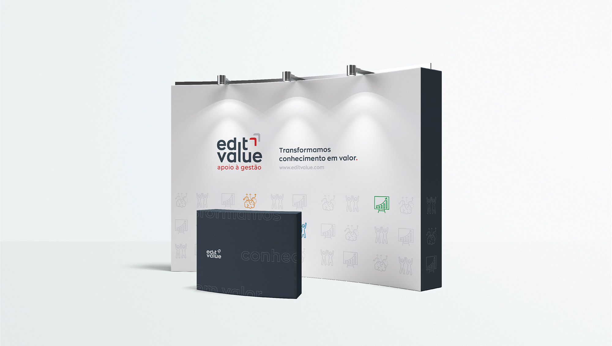
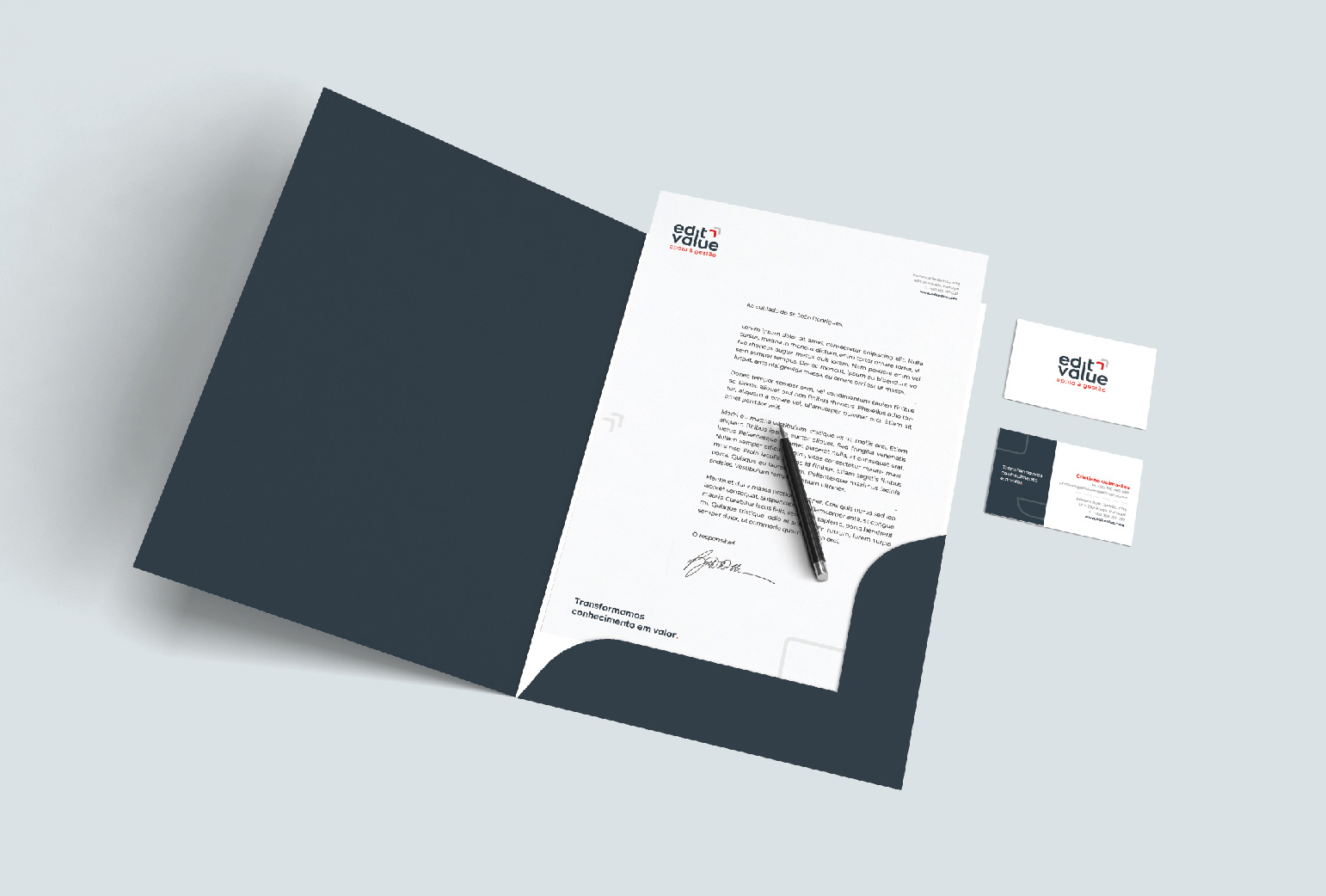
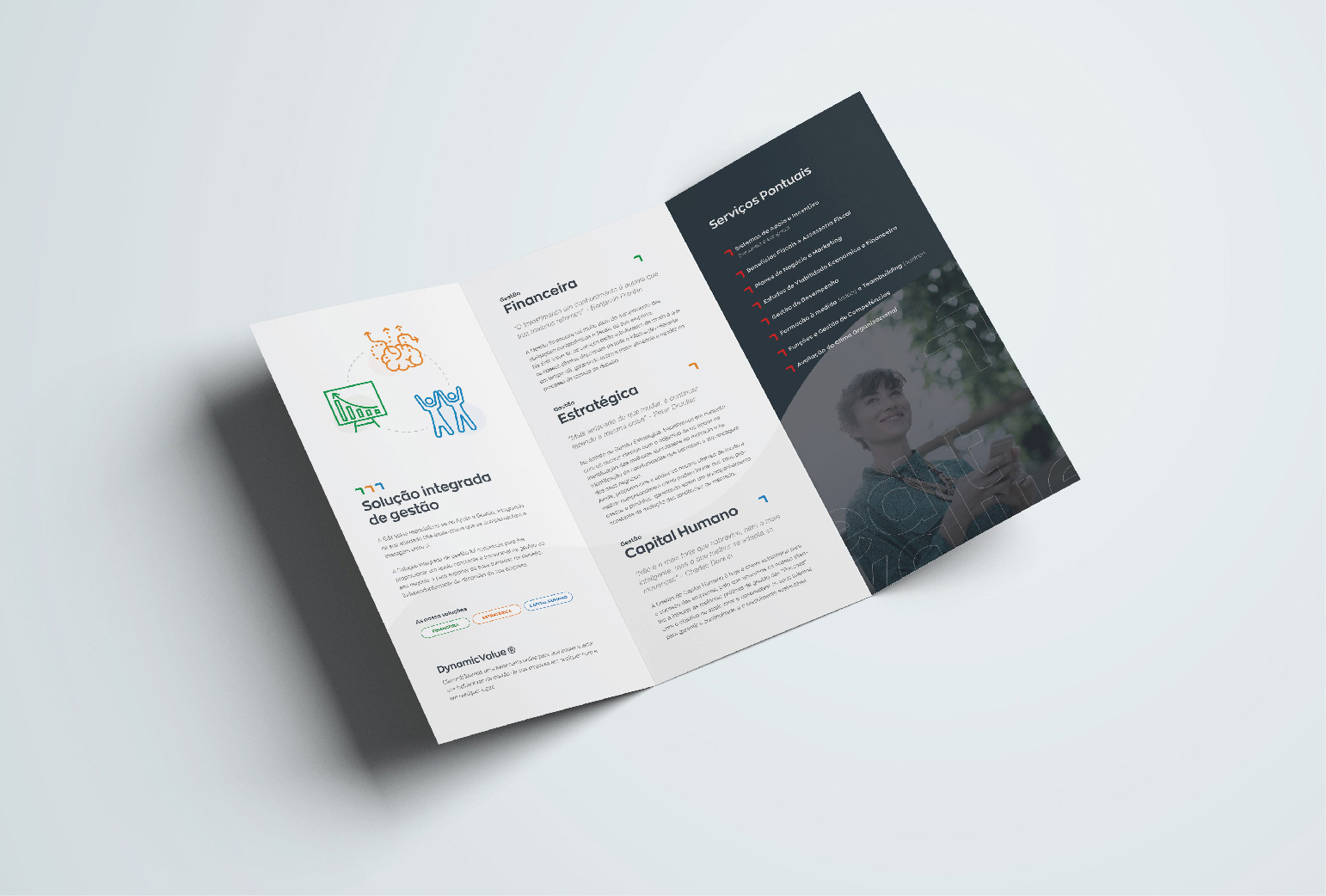
Various communication media have been created, from the traditional stationery, flyers, calendars, roll-ups, digital presentations, signs, vehicles and window decoration.
Tipography and color
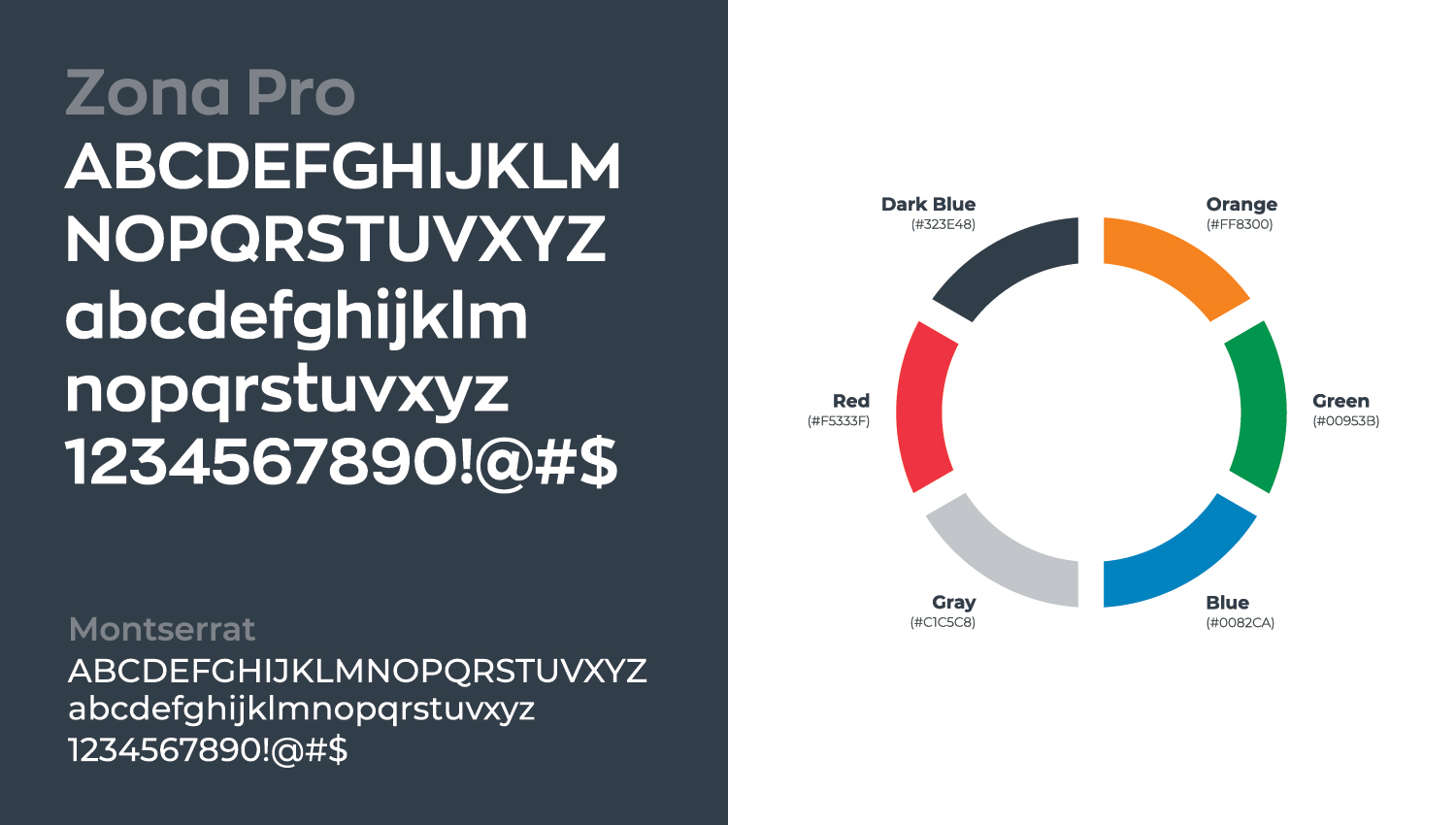
In addition to a new logo, the typography was also changed. Edit Value started to be represented primarily by Zona Pro, a more modern, irreverent typeface family, that still conveys the company's untouchable values: trust, solidity and rigor.
The color palette was also refreshed, with the introduction of new colors such as orange and green. This reinforcement was necessary due to the company's new form of communication, now based on 3 new services: financial, strategic and human capital.
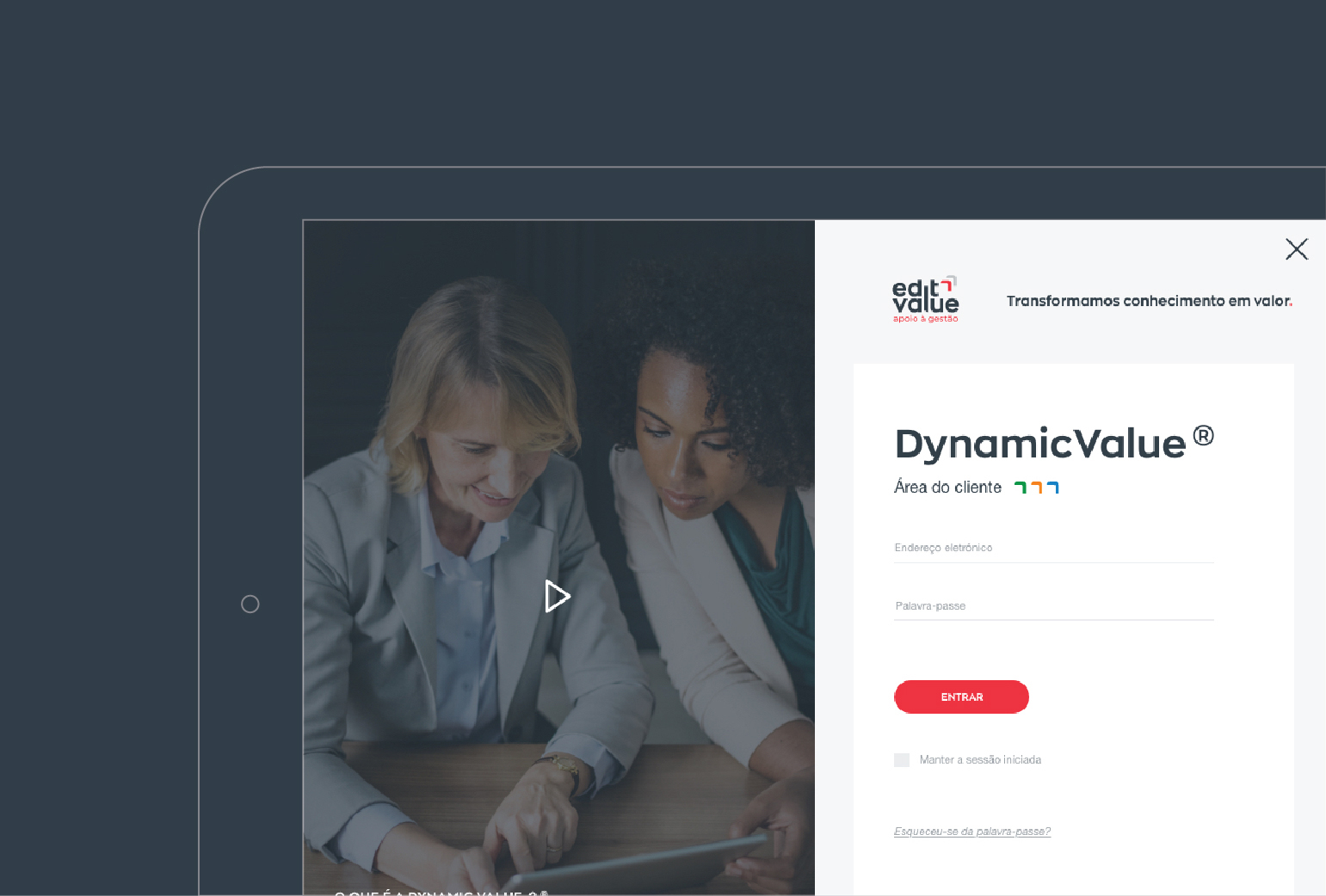

The Dynamic Value platform is one of the company's unique and differentiating factors in the market. In this management support tool, customers can generate reports to monitor their economic activity, analyze growth indicators and set up automatic alerts to control expenses.
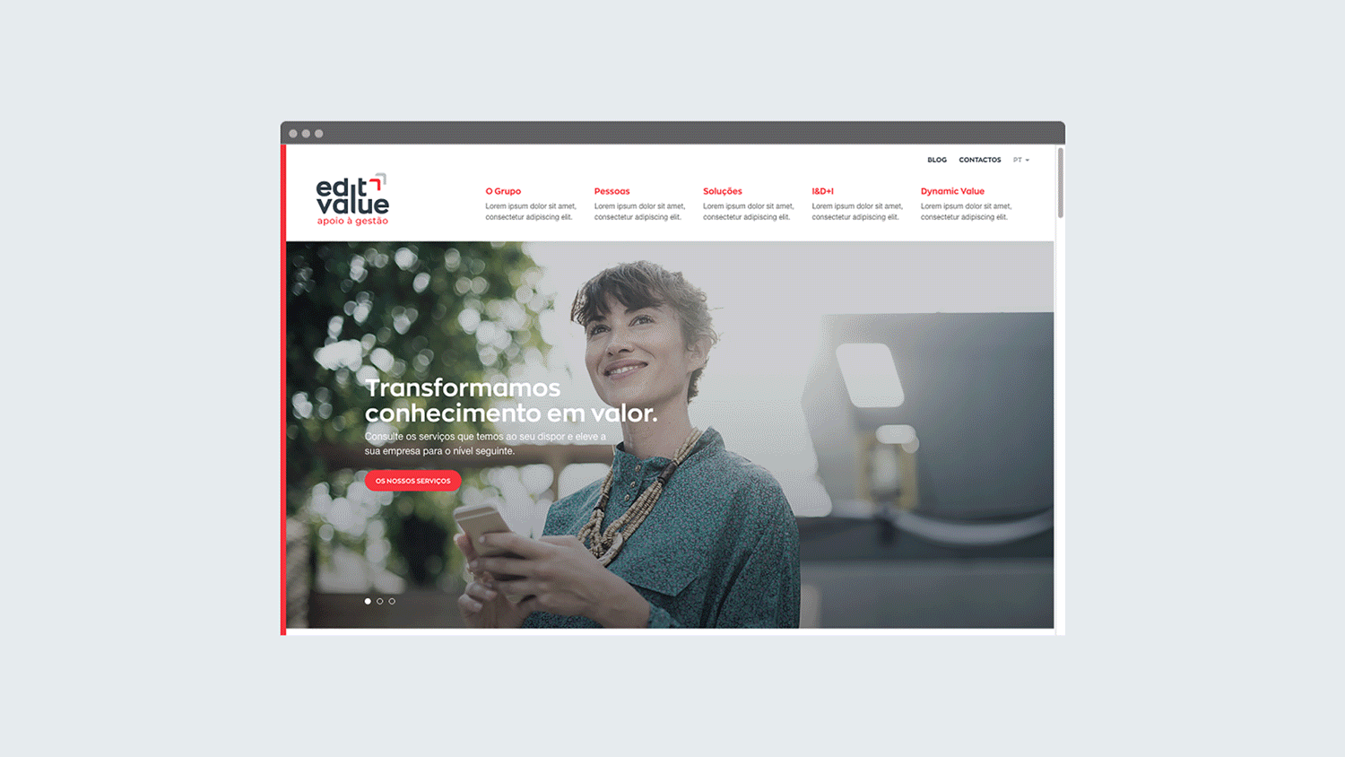
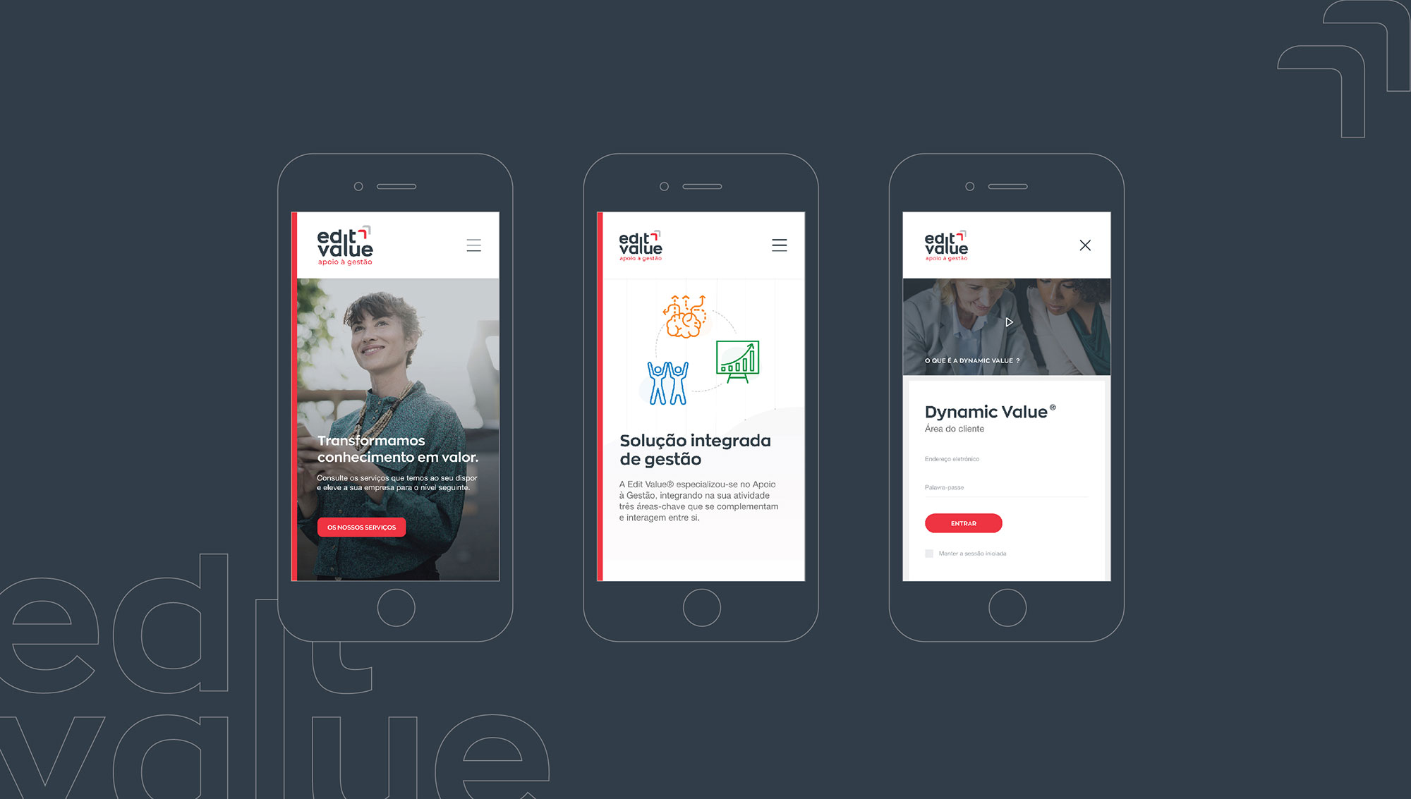
Website
One of the key points in the entire process of renewing the Edit Value brand.
There was a need to communicate the company in a more complete way, from its business strategy, the solutions available to customers, the innovation projects they are involved in, as well as presenting the entire team behind the Edit Value structure .
A platform was developed to meet all these needs, introducing the company in a broader and more professional way.
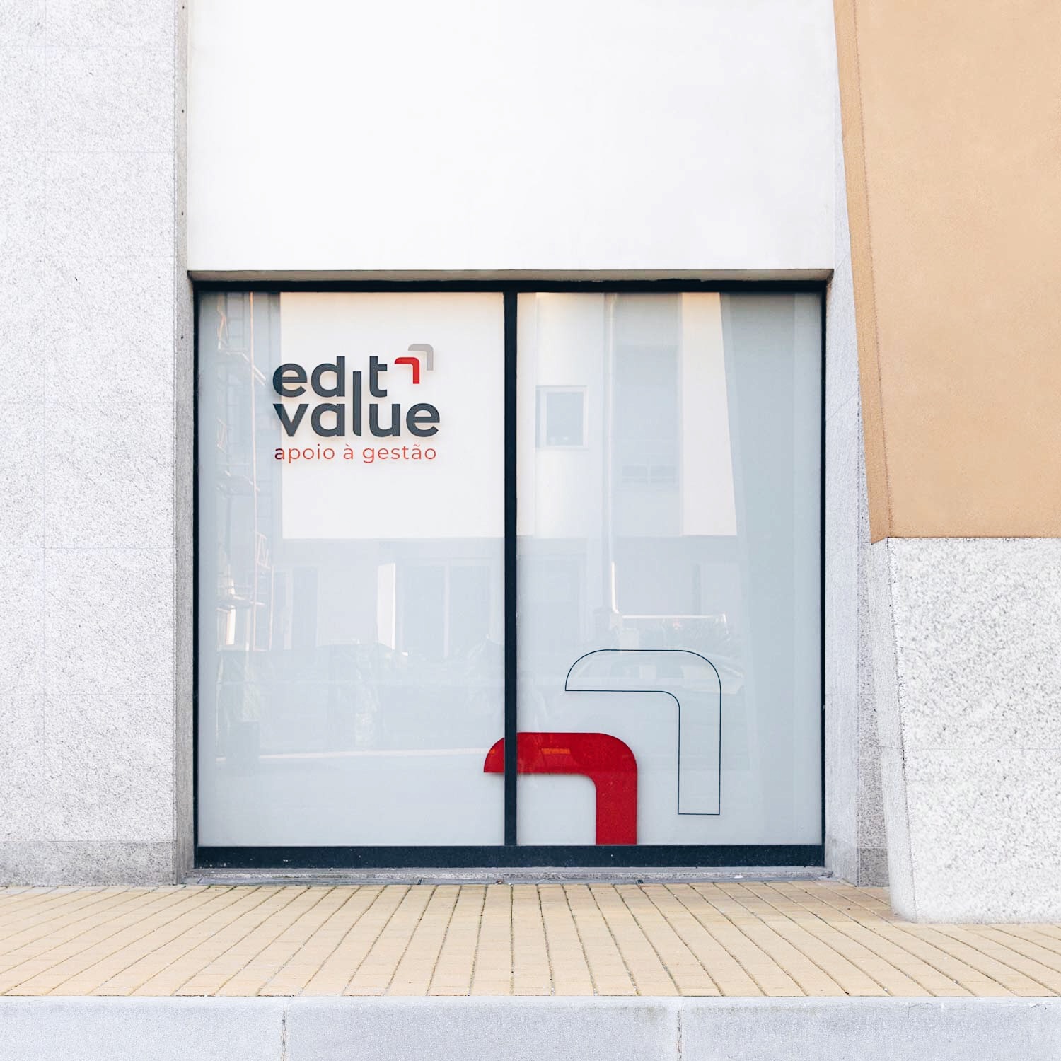
Offices
With the opening of a new space in Porto, Edit Value also advanced with the renovation of its main office in Braga.
In addition to the internal redesign of the workplace, the glass facades received the new identity.
EXPLORE MORE PROJECTS
Póvoa de Varzim | Diogo CostaBranding
Ambitrevo | Diogo CostaBranding
Edit Value | Diogo CostaBranding
Jordilis | Diogo CostaBranding